
The Airport Operations Centre System (AOCS) is the command, control, and collaboration platform at the heart of Changi Airport’s day-to-day operations. Made up of multiple modules with each serving a specialised function, it enables airport stakeholders to see the most up-to-date status of flights, passengers, baggage, and airside activities, helping them operate efficiently, anticipate issues, and respond to incidents quickly.
As part of the design team, I worked across all modules alongside two other designers; owning the design for Airside Work Permit (AWP), Tow Management, Turnaround, and Base Map features, while also overseeing iterative improvements to workflows across the platform.
For this case study, I’ll be zooming in on AWP as the module required me to design for complex map-based interactions (something I had never tackled in previous projects). It came with a set of highly specific, operationally critical UX challenges: precise spatial drawing, managing overlapping work zones, and enabling clear situational awareness in a live, high-stakes environment. Solving these problems demanded both creative problem-solving and careful collaboration with stakeholders.
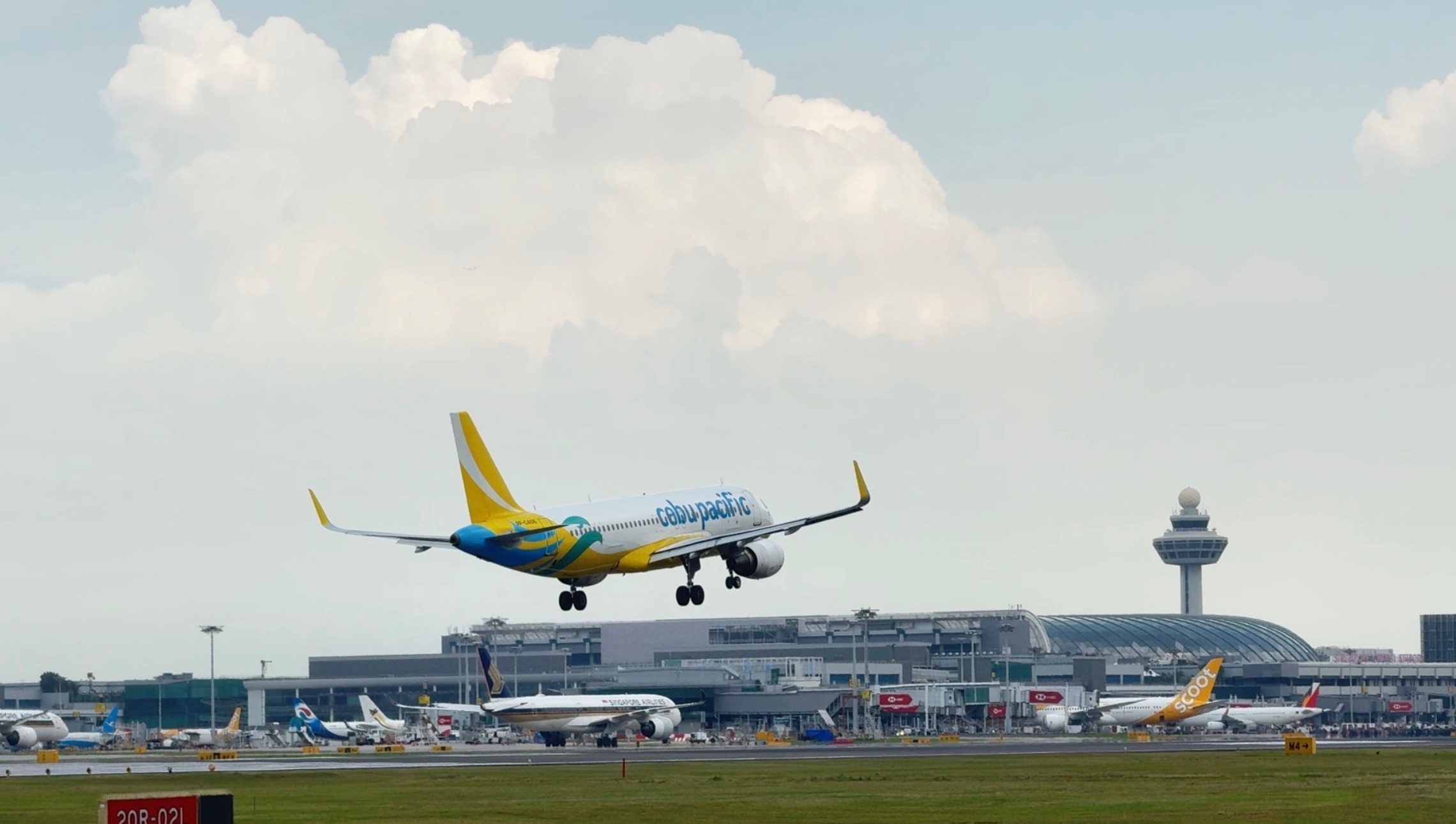
Aircraft landing at Changi Airport.
Introduction
The Airside Work Permit (AWP) module in AOCS is a critical tool for CAG. It enables them to record, manage, and track permits for airside works, marking the start and end dates, statuses, and associated work areas on a map.
The AWP Manager works primarily in the office, supported by a team, but the data is also accessed by a wide range of stakeholders - from operations control centre staff to ground crew - to understand ongoing and scheduled works across the airport.
This project was an interim upgrade: the business required that all functionalities of the previous system’s AWP be carried forward to the revamped and enhanced before the future transition to OneCal (managed by another vendor). A new requirement was also introduced: ongoing demarcated areas needed to appear on the AOCS base map for better situational awareness.

Shadow session at the airport operations centre.
Research Process
The research involved four collaborative sessions with the AWP Manager and team. I worked with a Business Analyst to conduct workshop session in order to gather pain points and insights using the following methods.
Contextual Inquiry — While I couldn’t directly observe permit creation, I reviewed screenshots of the current system and had the manager walk through their process in detail to understand how he would record the permits and what the different statuses mean.
Pain Point Elicitation — We openly discussed challenges, frustrations, and workarounds.
Workflow Analysis — The team shared that an Excel permit record is used alongside AOCS, revealing the complexity of tracking and referencing, how a permit would move from one state to another and how certain actions triggered by the user
Validation Session — Once the designs are done, we walked through the proposed designs, capturing feedback on and refining based on their input.
The team and I used affinity mapping to organise the findings into four categories:
- Workflows & Status (a deep dive into how different permit statuses functioned)
- Problems
- Wants and Needs
- System Related
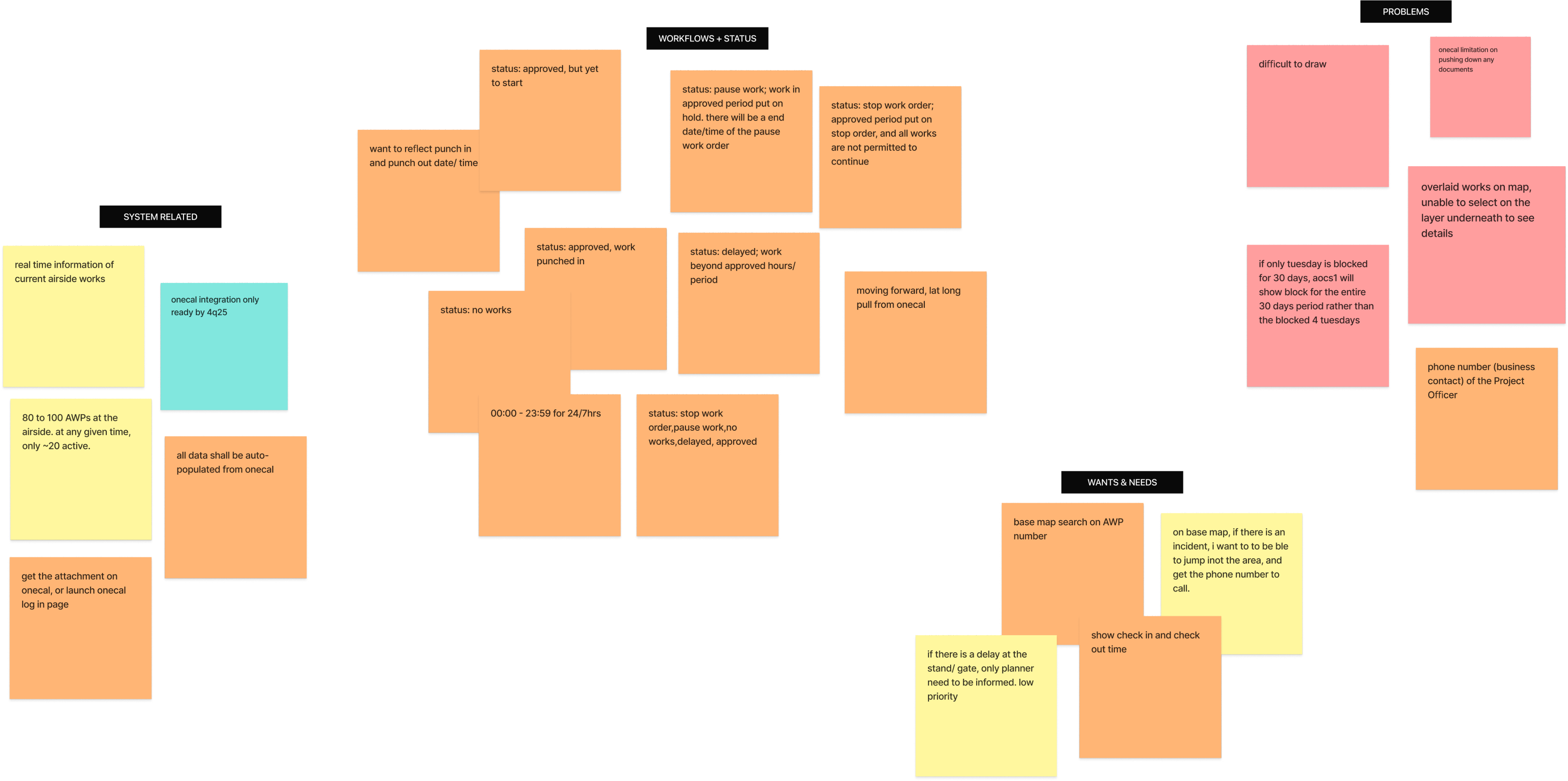
Affinity Mapping of insights gathered during the first few workshops.
Paint Point 1 - Overlapping Zones
On the airside map, multiple work zones can overlap; like a stack of transparent sheets layered on top of each other. While all the zones are visibly outlined, the system only allows interaction with the topmost layer. This means expired permits can block access to active zones beneath them, and scheduled works can hide ongoing ones. For the AWP Manager, this creates a frustrating bottleneck: he sees the zone he needs, but he can’t click it to make edits or updates. The workaround for this was to use a combination of the date range and status in the filter function to access the AWP in question, which takes additional time and clicks.
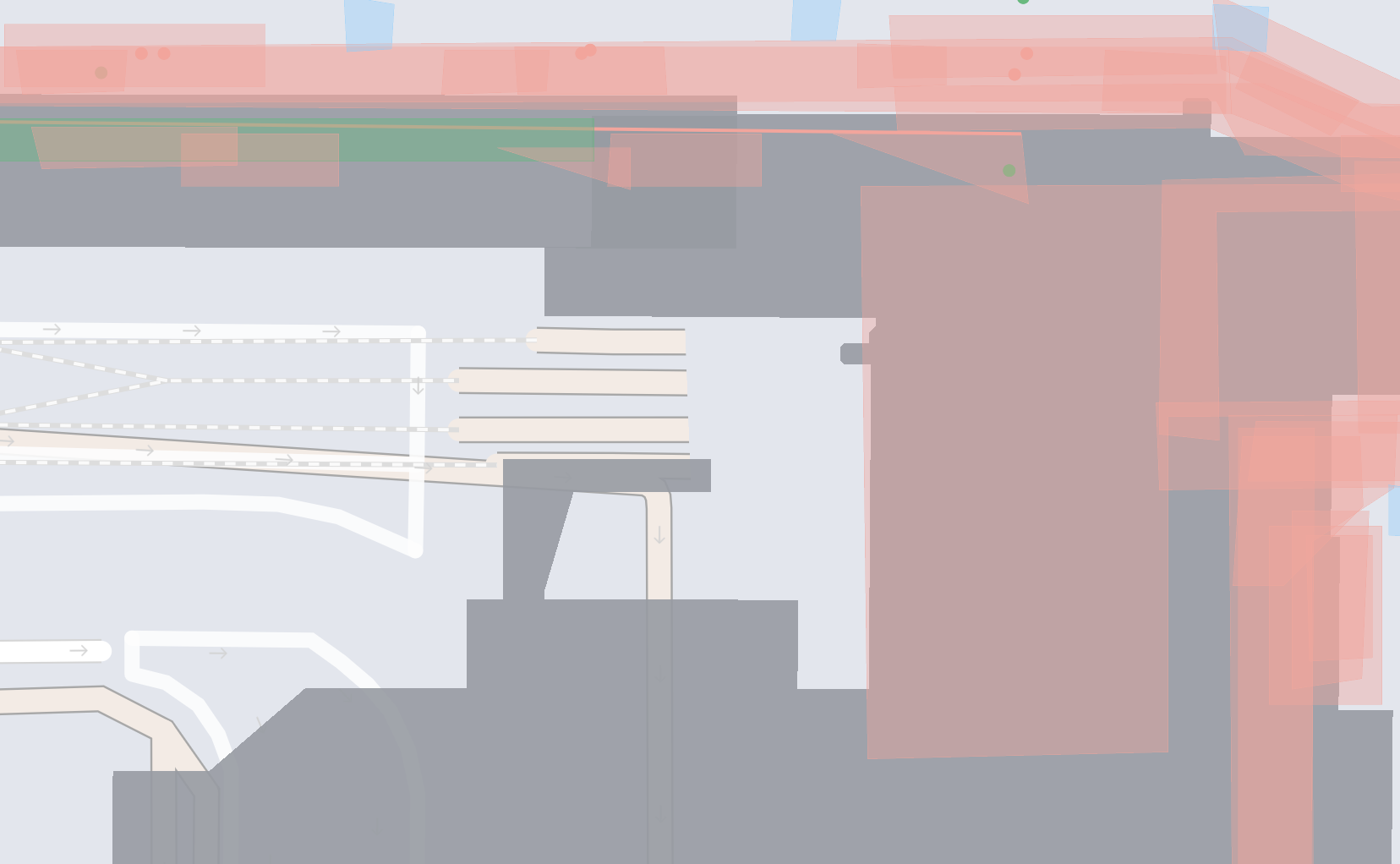
Overlapping work zones with different different colours (statuses), Dark grey: Terminal Building.
Pain Point 2 - Drawing Difficulties for Precise Demarcations
Accurately drawing demarcated areas on the map was challenging for two reasons:
- Limited Zoom: The map only allowed zooming to a fixed level, making it hard to work on narrow strips like taxiways. Users had to switch to the line tool — less accurate and not true to the real shape.
- Forced Grid Snapping: Polygon points snapped to a fixed grid, preventing precise tracing of irregular boundaries and causing incorrect shapes.
These constraints made it difficult to accurately represent real-world work areas, creating potential safety hazards.
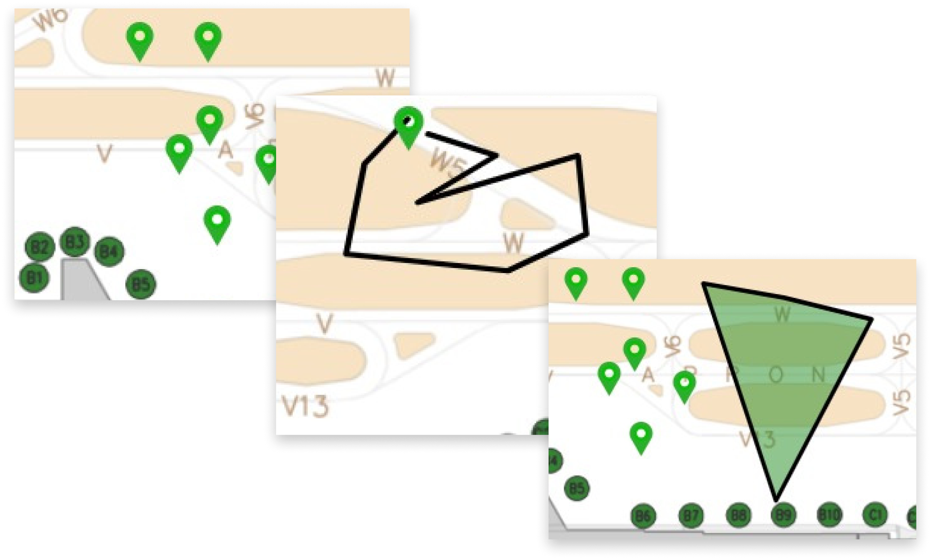
Point, Line, and Area demarcations.
Pain Point 3 - No Direct Way to Contact the Officer in Charge
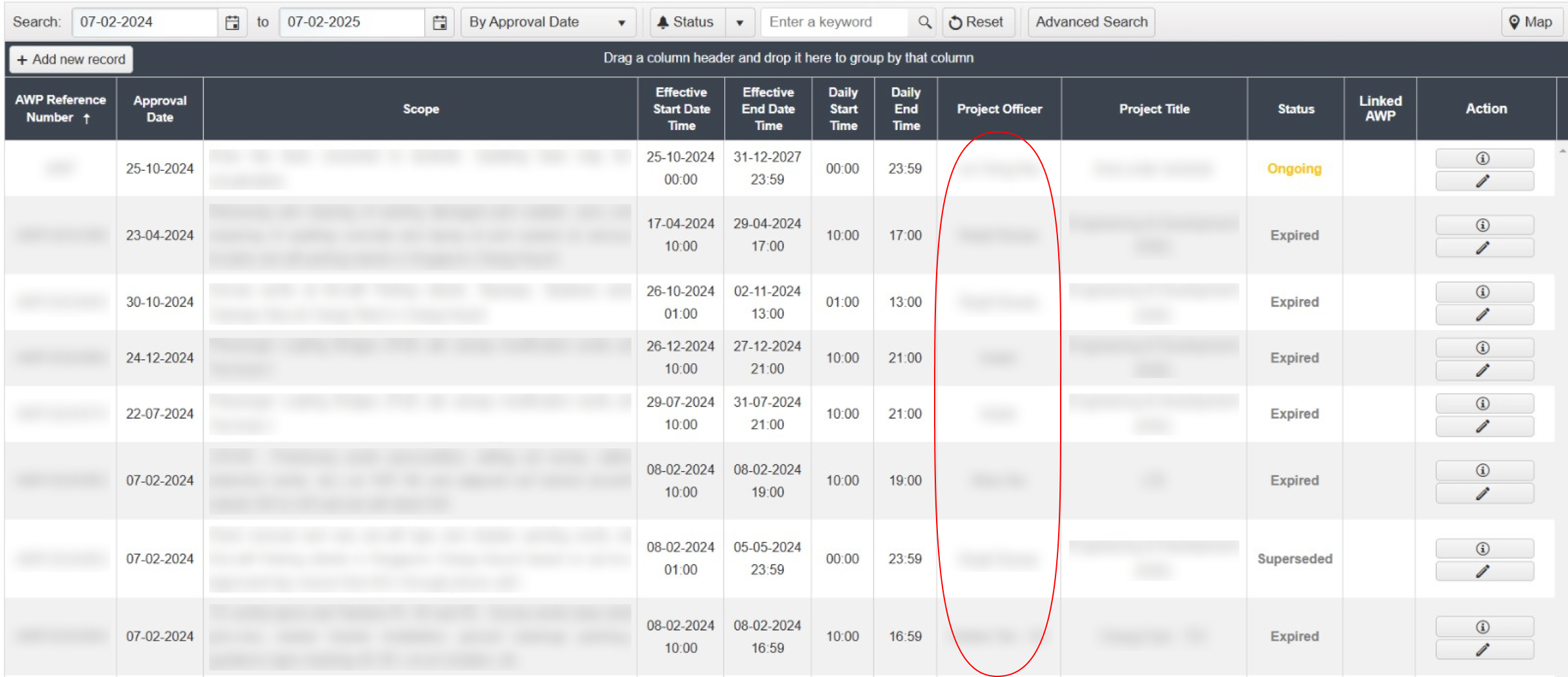
When viewing a permit, users can see the name of the officer in charge, but there’s no built-in way to contact them. In situations such as unforeseen work delays, urgent changes, or incidents affecting airside operations, this lack of direct communication creates delays in coordination and increases operational risk.
Multicoloured: Overlapping work zones, Dark grey: Terminal Building
“How might I enable users to create and adjust areas with precise boundaries, so that information are also accessible and identifiable with minimal number of clicks?”
Work in Progress...
Stay tuned for updates on case study. Check out my Behance account in the meantime.