
The Institute of Banking and Finance Singapore (IBF) is a not-for-profit industry association to foster and develop the professional competencies of the financial industry. IBF was undergoing transformation, which includes a website redesign and data migration to new Content Management System.
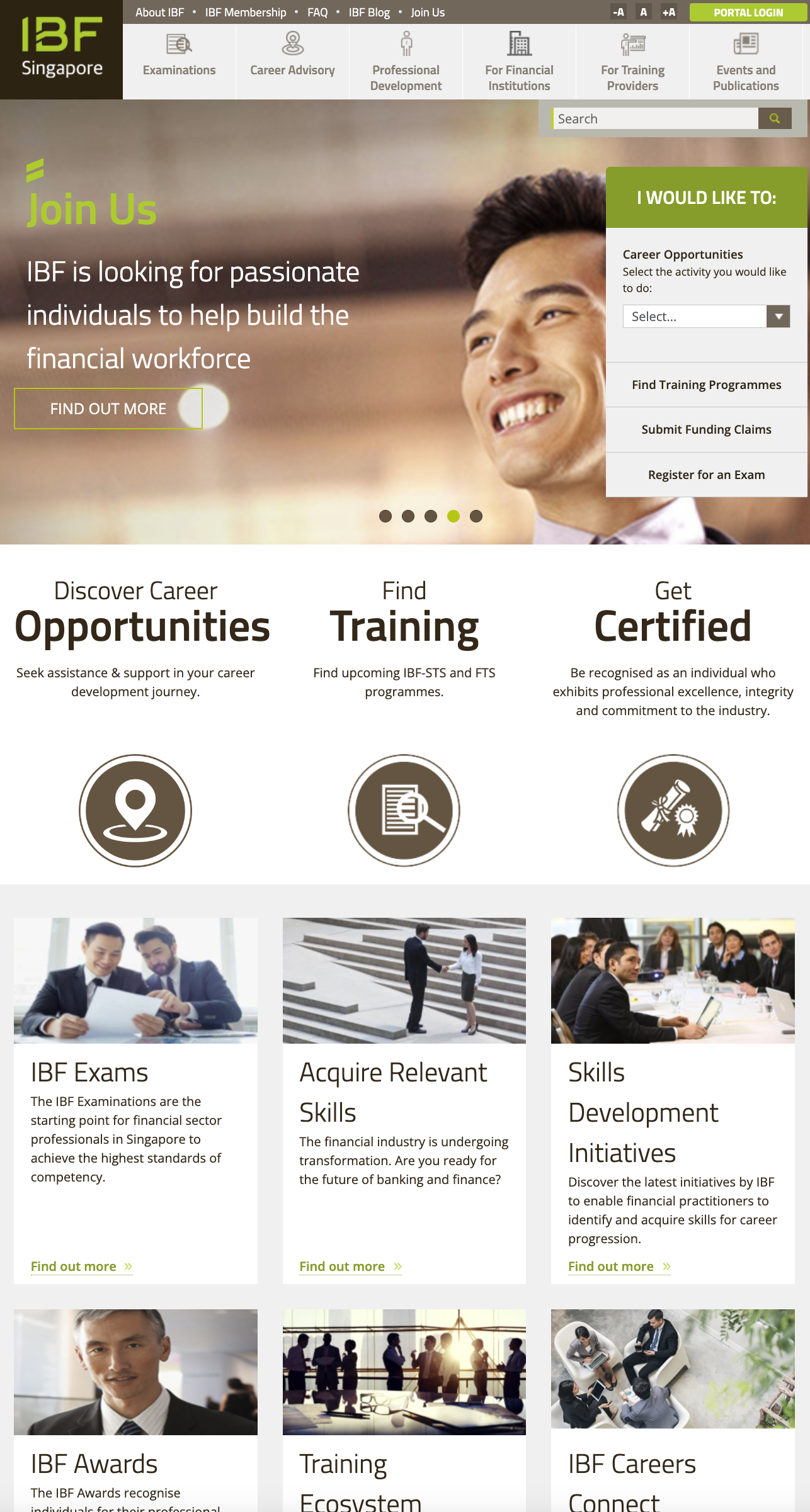
IBF old landing page
My Contributions
As a UX designer, it is important to understanding first-handedly the client’s goals as well as the users’ pain points in order to design for both their needs.
I worked with the UX researcher to deep dive into uncovering issues, designed the wireframes for usability, and worked with the UI designers on the design system for a cohesive outcome.
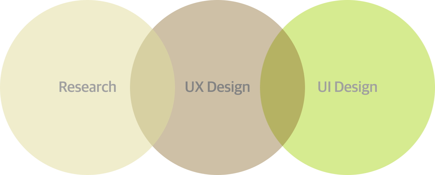
My contributions as a UX designer.
Approach
The methods chosen for this project closely resembles the Double Diamond model. While we diverge during the Discover and Develop phases, we also constrain the scope of research and prioritise design
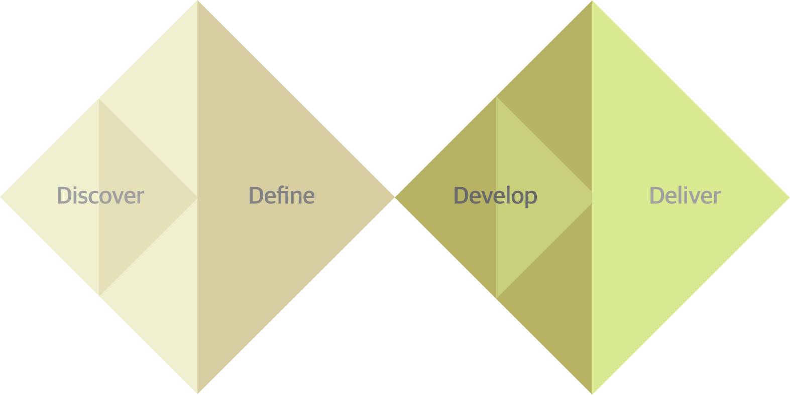
Double Diamond.
Discovery

Define
Develope

Deliver
Findings
There are a total of 7 personas identified among the user groups. The different combinations of services used as identified from the user groups form the basis of these seven personas. These services include:
- Financial Professional (Highly motivated)
- Financial Professional
- Jobseeker
- Career Switcher
- Career Switcher (TFIP - Technology in Finance Immersion Programme)
- Training Provider
- Financial Institution
These personas use a combination of these services provided by IBF:
- Examinations
- Training programmes / courses
- IBF Certification
- Funding
- Events
- Career Advisory
- Technology in Finance Immersion Programme
- Claims / Notices
- Programme Accreditation
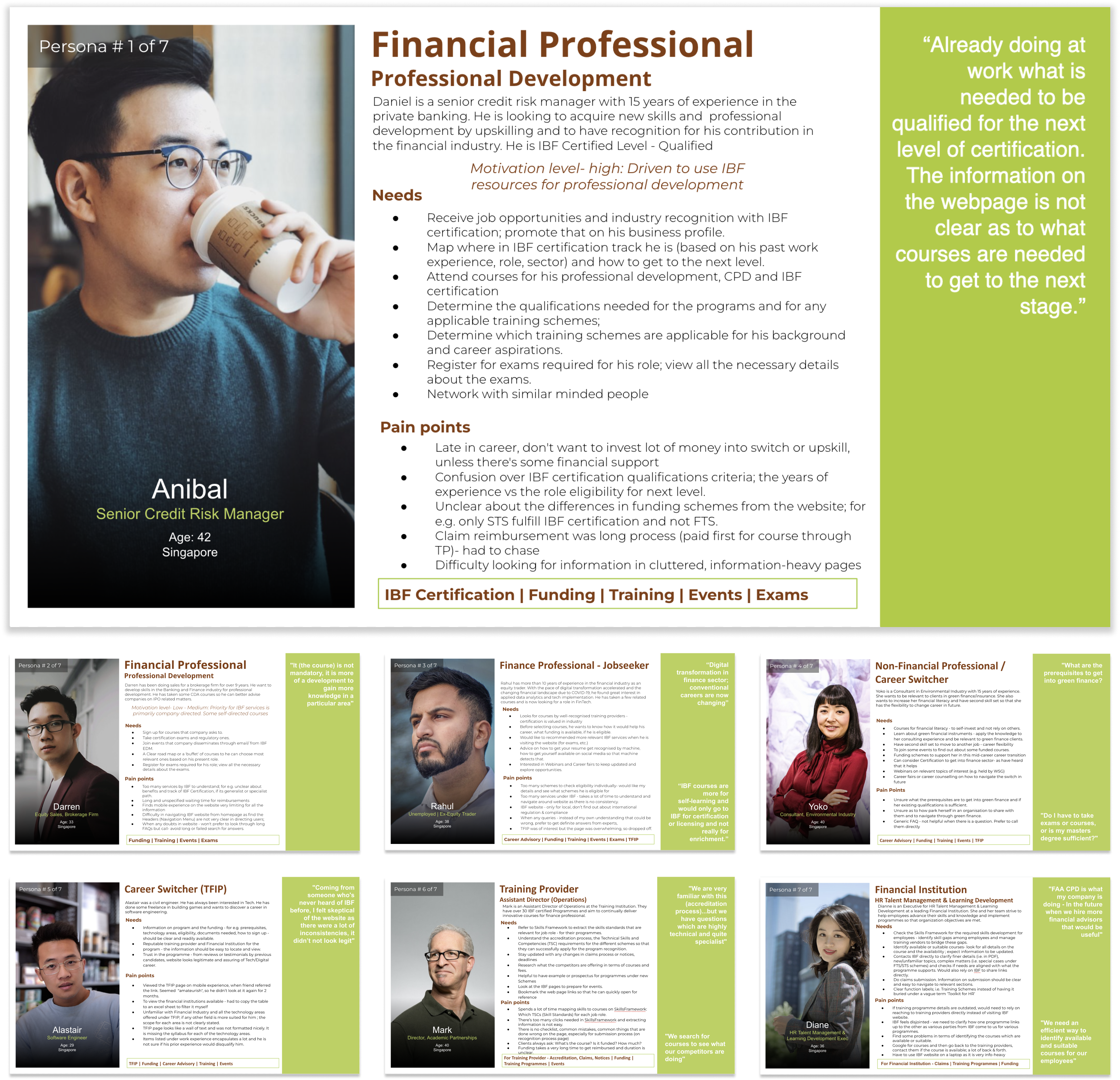
The seven personas of IBF.
Insights
- Users have difficulty finding information
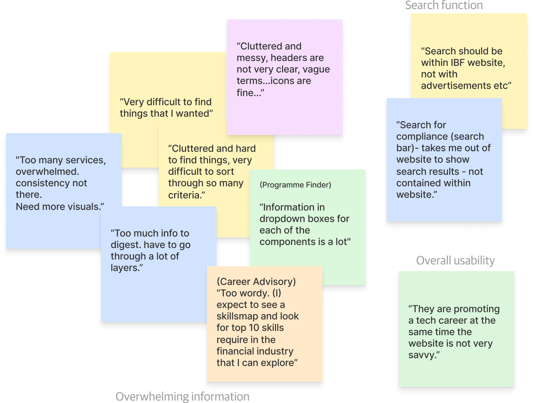
A commonality from the feedback gathered from all users is that the website is too cluttered and messy, lack consistency, information is hidden under many layers and there is no visual guide. Therefore, locating information is difficult.
The universal search function on the website shows Google search results with advertisements, causing a disjoint in the user journey.
This problem can be attributed to several reasons:
Poor Information Architecture
- The items in the navigation menu are listed downwards in a narrow column with minimal negative space laterally and in between each of the items. Furthermore, sub-level menu only appears upon mouse-over. These items have vague labels and are also not sorted logically. All issues cause difficulty in isolating the menu items and adds a layer of cognitive load on the users.
Webpages are very text-heavy
- Due to the immense amount of information on the website, the pages tend to have a lot of text. These texts are missing and some are not chunked strategically and placed where and when users need them. There is no consistent layout in the grouping of information and also a lack of useful visual guide one some of the pages.
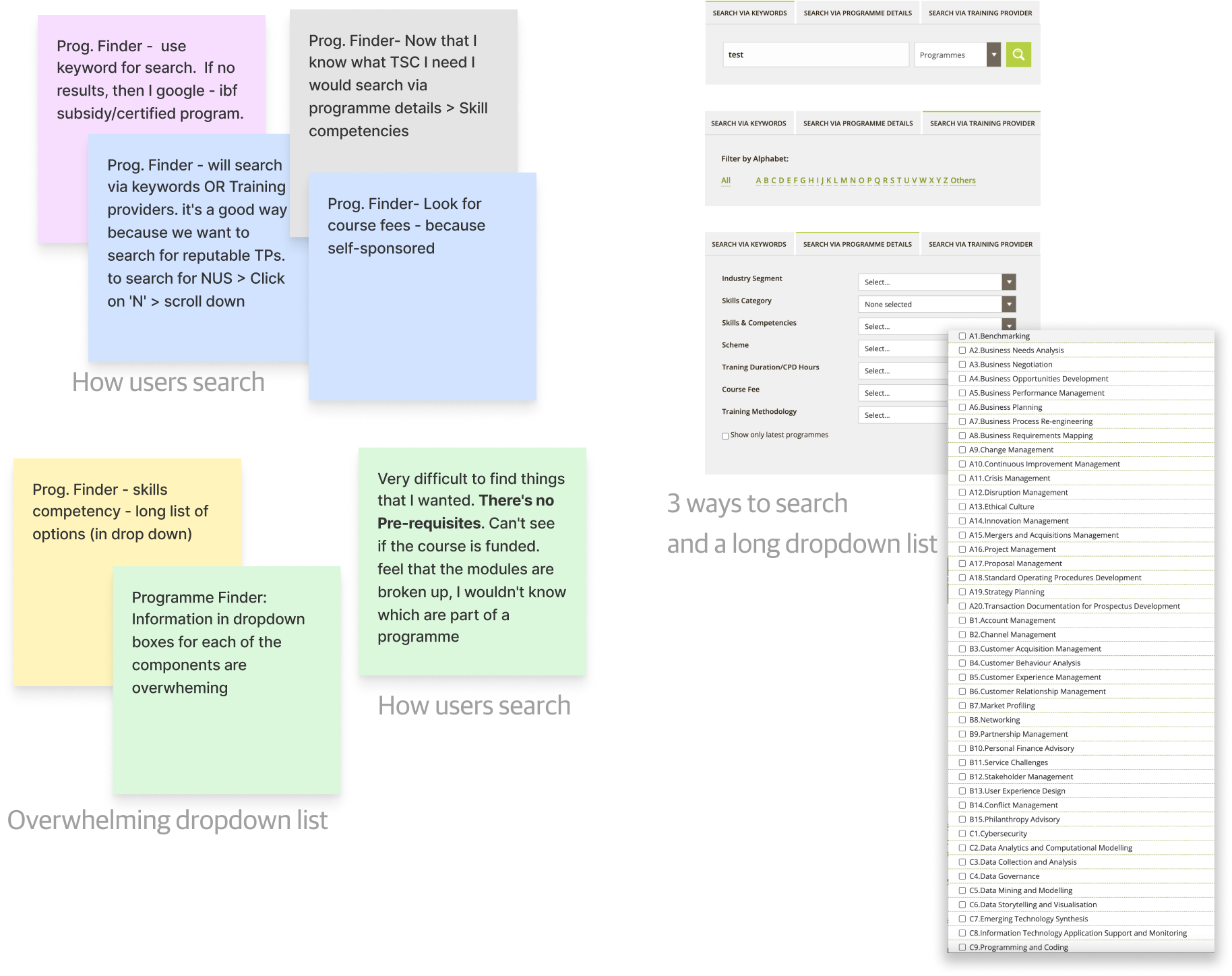
2. Programme Finder search function is not intuitive
Searching for a programme or a course using the ProgrammeFinder is cumbersome as there are three separate tabs you can search by, but not all.
The dropdown menu for Skills and Competencies are too long and overwhelming.
- Users were unclear as to what IBF does and how IBF can help
During the user research, it is found that a majority of users do not have a clear understanding of IBF’s services or are totally unaware of some services offered. For example, most users have the perception that being IBF certified means having taken a regulatory examination with IBF. They also did not know IBF provides career advisory service. Users who eventually do find out about IBF’s services find it difficult to assess the usefulness, benefits, and what the next steps are.
No clarity on purpose and benefits
- On pages such as IBF Certification has poor clarity as to which level users qualify for and how to get to next level. Users are also uncertain how getting certified can help in one’s career due to the lack of industry recognition. Some users also mentioned how they are unsure what their career path would be after taking a course or an examinations.
Lack of persuasion and clear Call-to-Actions
- The webpages are information packed but there is no proper copywriting or any persuasion to steer users towards taking a specific action i.e registering for examinations. For users who are decided, there is also a lack of clear CTAs where users can take action to achieve their goal.
“How might we improve the information architecture, reduce cognitive load and let users know the purpose and benefits of IBF?
Work in Progress...
Stay tuned for updates on case study. Check out my Behance account in the meantime.


