
Calvin Low
Work
About
Contact
Concept
The French Press gets its name from the device itself, drawing inspiration from the simple yet mechanical feature of the coffee maker: clean straight lines, angled corners, and symmetrical curves.The logo would have a utilitarian look; no-frills but stylish, reflecting the fundamental function of the French press and the coffee it makes.
Almost rudimentary or even primitive, The French Press is an ode to the very reason why we visit a café: to enjoy a delicious cup of coffee.
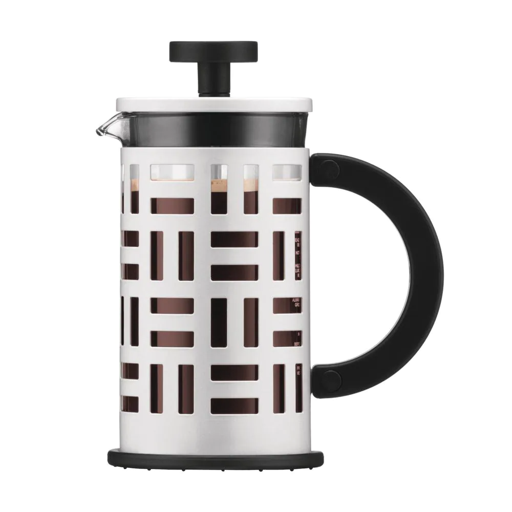
Bodum Eileen
Mood
The café would be minimalistic with concrete floors, dark cabinetry, white countertops with elements of wood. Some of the words that can be used to describe The French Press are moody, clean, and definitely minimalist. The colours and textures would consist of matted blacks, greys, shades of white, walnut and shiny brass or gold.

Minimalist and muted colours.
Design
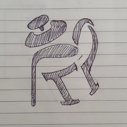
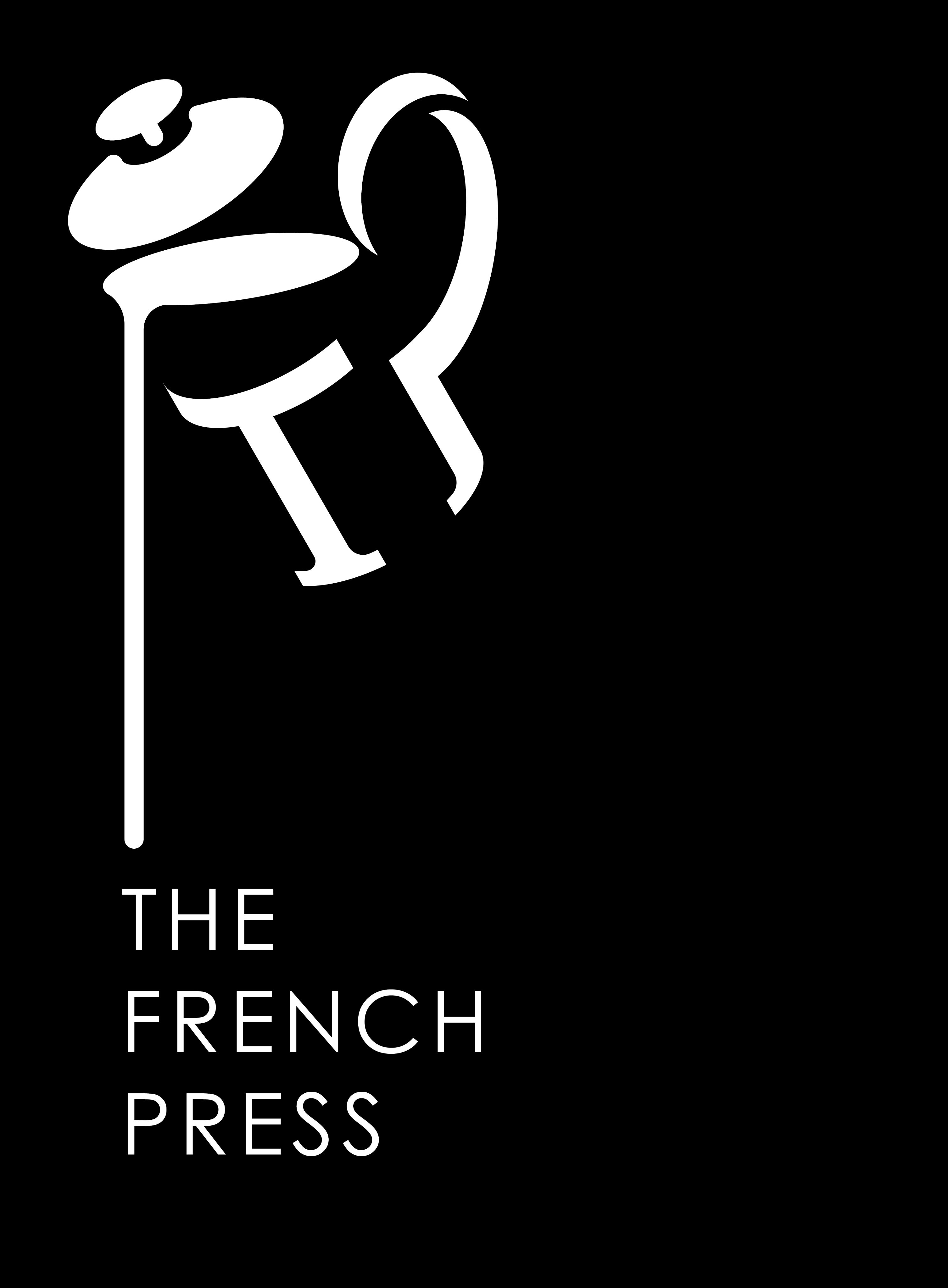
The inspiration behind the logo was the French press; one in the midst of pouring.
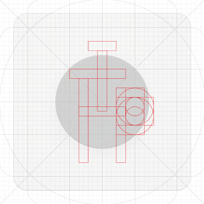
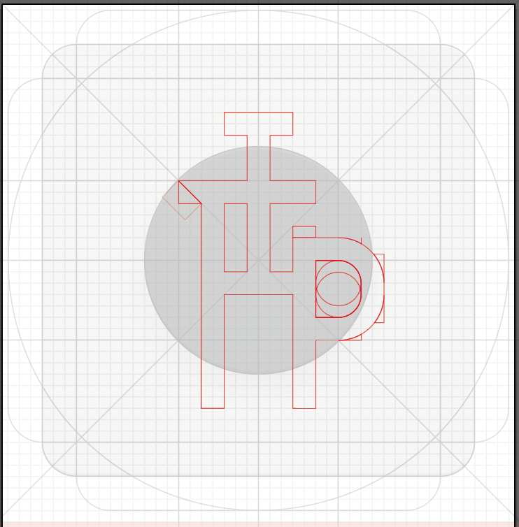
A sketch is then drawn and carefully crafted using Gestalt’s Principle of Closure, exploiting the negative space to complete an illusion of the the French press. Upon closer inspection, the initials TFP can be seen in the logo.
However, the design suffers from a lack of adherence to the idea of minimalism.


Evolution of the initial design
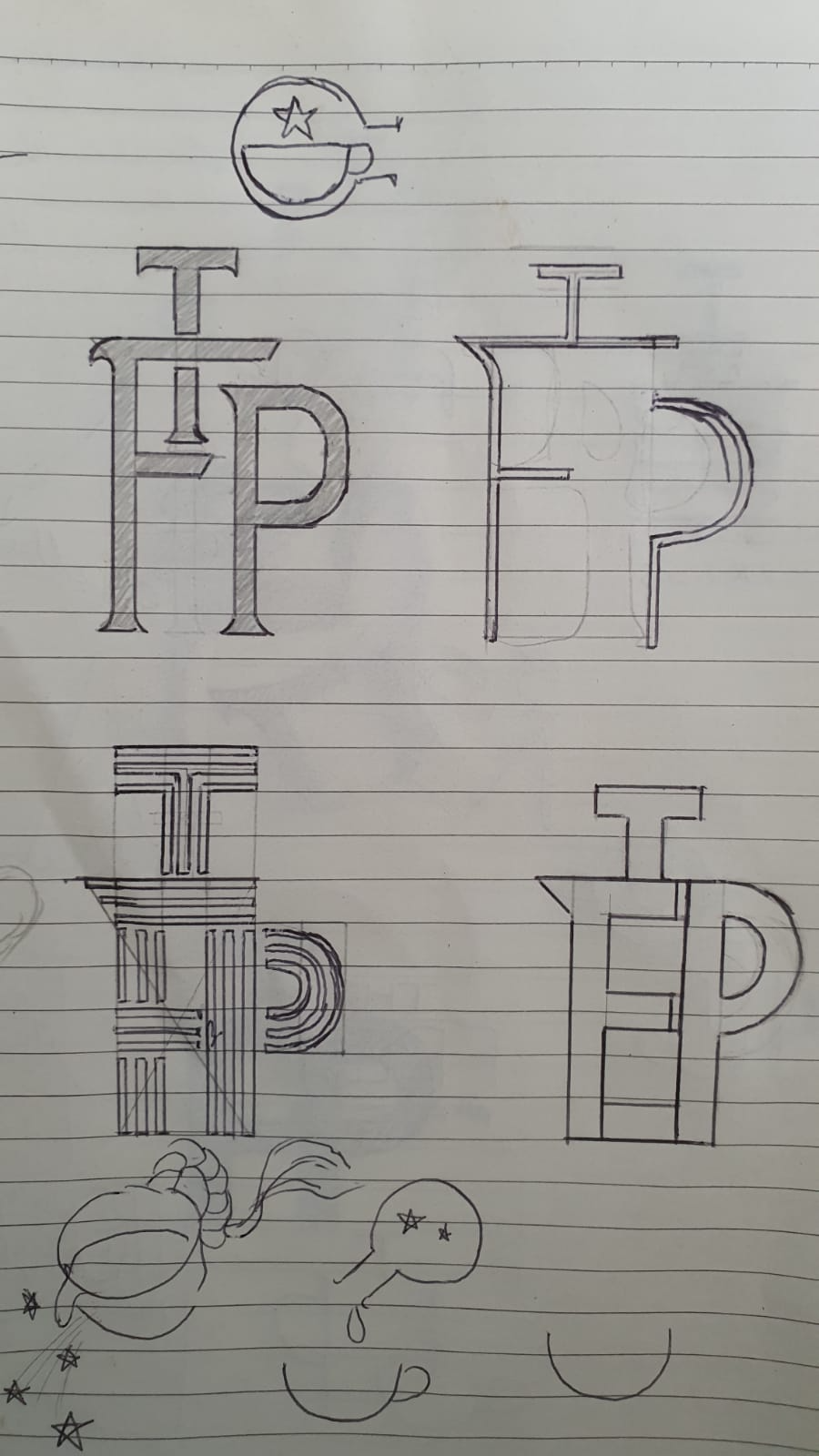
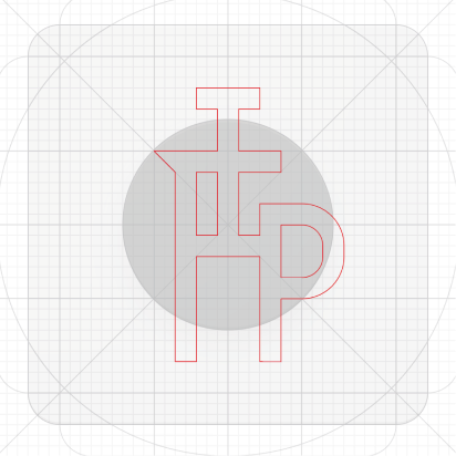
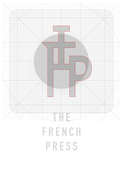
The second idea uses the brand initials TFP to form a lettermark with the resulting monogram forming a pictogram of a French press. This inspiration comes from the design of Bodum’s Eileen French Press’ stainless steel body with its clean and geometric cut-outs. To tie in with the quasi-Oriental vibe, the word ‘ka’ (咖) from the Chinese word for ‘coffee’ (咖啡) can also be morphed into a pictogram of a French press.


Evolution of the initial design
Work in Progress...
Stay tuned for updates on case study. Check out my Behance account in the meantime.
Calvin Low
Work
About
Contact
Concept
The French Press gets its name from the device itself, drawing inspiration from the simple yet mechanical feature of the coffee maker: clean straight lines, angled corners, and symmetrical curves.The logo would have a utilitarian look; no-frills but stylish, reflecting the fundamental function of the French press and the coffee it makes.
Almost rudimentary or even primitive, The French Press is an ode to the very reason why we visit a café: to enjoy a delicious cup of coffee.
Bodum Eileen
Mood
The café would be minimalistic with concrete floors, dark cabinetry, white countertops with elements of wood. Some of the words that can be used to describe The French Press are moody, clean, and definitely minimalist. The colours and textures would consist of matted blacks, greys, shades of white, walnut and shiny brass or gold.
Minimalist and muted colours.
Design
The inspiration behind the logo was the French press; one in the midst of pouring.
A sketch is then drawn and carefully crafted using Gestalt’s Principle of Closure, exploiting the negative space to complete an illusion of the the French press. Upon closer inspection, the initials TFP can be seen in the logo.
However, the design suffers from a lack of adherence to the idea of minimalism.
Evolution of the initial design
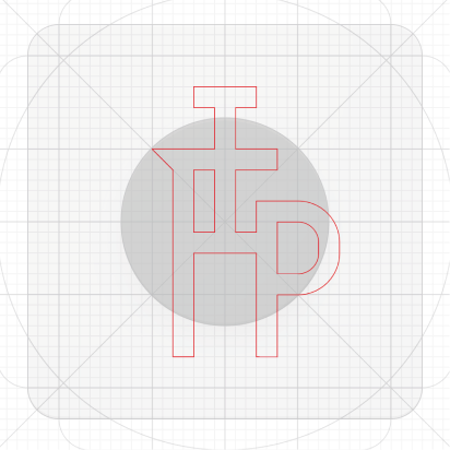
The second idea uses the brand initials TFP to form a lettermark with the resulting monogram forming a pictogram of a French press. This inspiration comes from the design of Bodum’s Eileen French Press’ stainless steel body with its clean and geometric cut-outs. To tie in with the quasi-Oriental vibe, the word ‘ka’ (咖) from the Chinese word for ‘coffee’ (咖啡) can also be morphed into a pictogram of a French press.

Evolution of the initial design
Work in Progress...
Stay tuned for updates on case study. Check out my Behance account in the meantime.